

Using color to your advantage
- December 20, 2017
- Author: Beth Harris
- Category: Creative, Design
Let me begin by saying, I am NOT an interior designer. So when I was asked to weigh in on some of the latest “Color of the Year” selections, I wondered whether I was the right person for the task. You see, we recently bought a new home, and I was thrilled that the previous owner had repainted the house a lovely shade of gray – a neutral color that gives me a blank canvas. Benjamin Moore’s color of the year, Caliente, and Pantone’s color of the year, Ultra Violet, are anything but neutral!
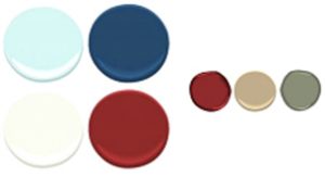
As a graphic artist, I love color. I notice color everywhere I go, and I have an instant reaction – love or hate – to most shades. Color can make or break how people perceive things, from the color of your house, to the color of your favorite sweater and, of course, to the colors a brand chooses for its identity. There are many facets to color psychology, but your brand color becomes synonymous with your identity, so it’s crucial that the color exemplifies the traits you want to portray.
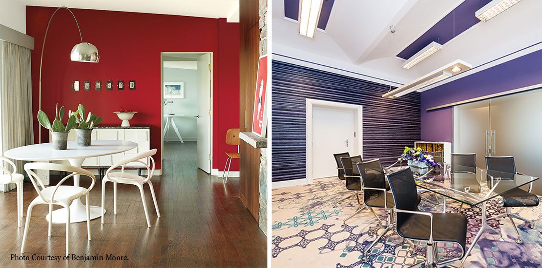
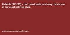
Caliente
Caliente can be described as bold, enthusiastic, lively and feisty. Benjamin Moore calls the color “hot, passionate and sexy.” So, if your company is a bank, a senior living center or a doctor’s office, caliente may not be your shade. If you are, however, a professional sports team, a restaurant or a salon, caliente might be right up your alley. Think about the statement you want to make about your brand and then decide whether caliente sends the right signal.
If you are drawn to a color like caliente for your brand, you should also find coordinating colors that tone down the vibrant shade. With strong colors, more isn’t always better. Using caliente strategically and sparingly can convey your message without becoming overwhelming.
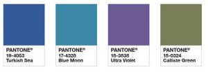
Ultra Violet
Pantone chose Ultra Violet, calling it a “dramatically provocative and thoughtful purple shade that communicates originality, ingenuity and visionary thinking.” That’s a lot for a color to say, but I am instantly drawn to this rich shade. To me, ultra violet says warmth and comfort. Purple has often been associated with royalty and strength. Jewel tones also coordinate well together, which allows for a robust color palette when looking for complimentary colors. Ultra Violet would be a great shade for a spa or yoga studio, offering a calming and tranquil vibe. Its richness and depth would also lend itself well to a wine bar or coffee shop that focuses on a place for meaningful conversation.
Whichever way you are leaning, choosing brand colors and figuring out how to use them can be fun, but it’s not always easy. S&A can help you identify the right colors for your organization and show you how to use them effectively. Let us know how we can assist you.