

Sometimes less is more with design
- August 29, 2016
- Author: Ronald Dowdy
- Category: Creative
Usually, less simply is less. However, in the design world, a good minimalist approach to design can often be a better option. For some, minimalism may seem like a lazy way to design because it’s simply simple. The truth is, minimalist design actually allows a design to be more effective.
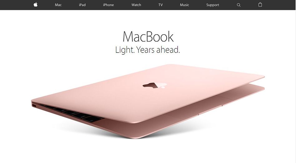
A perfect example of this is Apple. Though Apple’s color palette is primarily grayscale, this simple choice along with large white space allows Apple to show its colorful and detailed products in a clean and easily presentable way.
Though Apple is a perfect example of a brand that uses minimalist design, it doesn’t mean that minimalist design must be for the ultra-modern or sleek. There are companies on the other end of the spectrum that uses colorful palettes, textures, and dynamic images that are still considered minimalist designs.

Mack Trucks is a great example of this type of approach. Mack opts for a minimalist design while maintaining the brand’s character with textures and a louder color palette. Large and clean images of trucks throughout its branding actually work well within their minimalist design approach.
To sum it up, minimalist design is a well-thought-out approach to presenting a brand in the most efficient and effective way possible. So remember, white space in design is your friend and branding that has too much clutter is usually not the best way to get any message across.