

A little insight into two favorite logos
- December 15, 2015
- Author: Jim Sleeper
- Category: Creative
Logos are ubiquitous. And because logos are everywhere, they’re often taken for granted, or overlooked. A quick glance from my desk shows that I am inundated with logos. And you probably are, too.
Here’s my “from-my-desk-one-minute-logo-count”: S&A Communications, Auto Remarketing, Sharpie, Hi-Liter, Dell, Antigen, Fair Trade Certified, USDA Organic, Swingline, Logitec, ReaLemon, PaperMate, Pantone, Nestlé, Hershey, Google, Firefox, Microsoft Explorer, and WingSwept.
As a graphic designer, I’m often taking notice of logos wherever I am. Here are two logos that consistently stand out to me: Under Armour and BP.
So I got curious about their history. What do they stand for? Who designed them? Why the color choices? Thanks to Google this is what I found.
Under Armour
Under Armour was founded in the mid-1990s by Kevin Plank. Under Armour is probably the most popular sports attire brand in the world today. It seems everything my son wears has the Under Armour logo on it somewhere, displayed largely across the chest of his hoodie or as a subtle pattern inside his backpack.
The “U” and “A” are cleverly positioned over each other to make an interesting shape. The typeface was custom-designed for them. The company says that when the logo appears as white, it represents charm and elegance; and when the logo appears as black, it represents courage, excellence and prestige.
Here’s a link for more details on Under Armour’s history.![]()
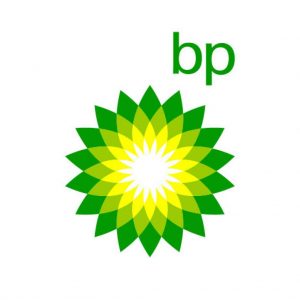
BP Oil Company
I really love this logo, even though the design isn’t what you’d expect from an oil company. Apparently BP (which stands for British Petroleum) paid $221 million for their rebranding/logo makeover in 2000! The lush greens and yellow flower/sunburst design seem more suited to organic food packaging. The colors were chosen in the 1930s simply to keep branding consistent around the world.
The current BP logo was designed by Landor Associates, based in San Francisco. They describe their design as a “helios” symbol. Helios was an ancient Greek sun god who drove his chariot across the sky each day. The green and yellow sunflower represents energy in different forms.
Here’s a great article and infographic on how much famous logos cost.
What are some of your favorite logos and why do they stand out to you?